http://picasaweb.google.ca/fauque.s.dawson/Alumni#
PhotoShop
Monday, September 14, 2009 | Posted by Simone Fauque at 7:02 AM |


duplicate background twice.
background copy-> filter->Blur->Gaussian blur (heavy blur)
Gradiant tool on blackground copy layer, drag from mid forehead to nose, to reveal sharpness in the eyes.
Background copy 3 (ignore background copy 2 it was a mistake you should only have 2 duplicates...)
Background copy 3-> filter-> Noise->add noise
Make sure layer with noise is on top of blue layer. In layers palette click soft light.
 I did the exact same thing as the previous photo...
Assignment 1 Portraiture
Monday, August 31, 2009 | Posted by Simone Fauque at 8:37 AM |

 Richard Avedon
Avedon's working methods are that the talks to his subjects throughout the session, and he documents their reactions. He lets his subjects relax and be themselves, and that is what he captures.
His most known work, is on a white or grey background, 2 stops brighter then the subject.
He uses an 8x10 view camera which is not very mobile, so subjects are generally places in the center of the frame, but if they move about freely that's where they end up. He does not use props.
I think the photos are worth while because they are soulful.
 Annie Leibovitz
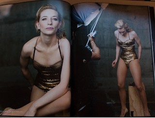
What I love about Annie's work is the character she capture in her frame. Her photos give the viewer the feeling that they are learning more about the subject in the frame then what is actually being portrayed. Her lighting goes from a natural day light to in studio lighting, I believe she often uses beauty lights, so large soft light sources. I've seen a documentary on Annie Leibovitz, and one of her favorite things to capture is the form of the human body. As shown in these three images, the women (who's name escapes me at the moment) and Jim Carry are both in minimal clothing revealing their body structure, and in the photo of the old man we see his wrinkles and sunken facial features. She seems to use peoples body composition and skin as texture in the photographs. I think the photos are worth while because they are soulful.


Irving Penn
What I love about Irving Penn is her choice of contrast and the texture she creates with black and white. Generally her lighting involves deep shadows yet prominent highlights.
Her subjects are often in the center of the frame, yet they take up a significant amount of space in the frame.
I think the photos are worth while because they are beautiful.


Ron Van Dongen
What is great about his work is the use of negative space, and obviously the deep bottomless shadows and the highlights highlighting the contours of his subjects.
I'm actually quite confused about Van Dongen's lighting... I feel like it may be light from the sides...?
The composition can vary but is similar, because there is often a main focus, where you see (example flowers) you see one whole flower, and on the edge of the frame suggesting that other flowers are around it.
His work is worth while because it is beautiful.
